Mobile App

United Airlines

I was part of the beautiful united redesign app team. The goal for the redesign is to provide a better travel experience and the version with new enhancements intended to make travel easier for people with accessibility problems. The redesign also includes faster processing, increased personalization options and more intuitive navigation.

  • Project United Airlines Redesigns Mobile App
  • date 2019 - 2021
  • disciplines RESEARCH / UX / UI DESIGN

01Mobile App Analytics Insights

Over the past 3 years, United has had the most downloaded airline app along with one of the highest downloaded travel apps

United has had the most downloaded airline app and one of the highest downloaded travel apps.

Mobile app visits are increasing 45% YOY, more significant in visits than.

Despite increased use, customer satisfaction has declined 10% per year over the past three years and continues to fall.

02Understanding the problem

High crash rates and response times 43% of online travel + lodging shoppers will abandon after waiting 3 seconds.

Customer inability to efficiently complete tasks. The mobile app and cell phone web page are horrible to navigate!

Consistency + user experience issues. Overly-complicated in every aspect of the user interface and so much potential is wasted.

A clear lack of innovation

03Strategic Response

Restoring satisfaction requires a balanced approach that follows a prioritized path.

Make reliability + performance a priority

Close known functional gaps

Improve user interactions + navigation

Provide more contextual experiences

Re-create areas of innovation + differentiation

04Key recommendations:

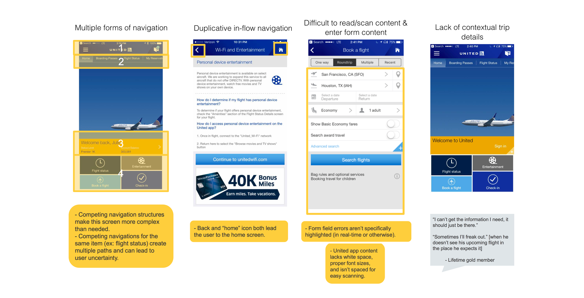
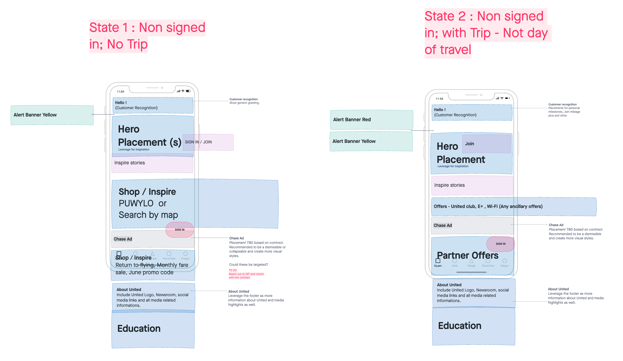
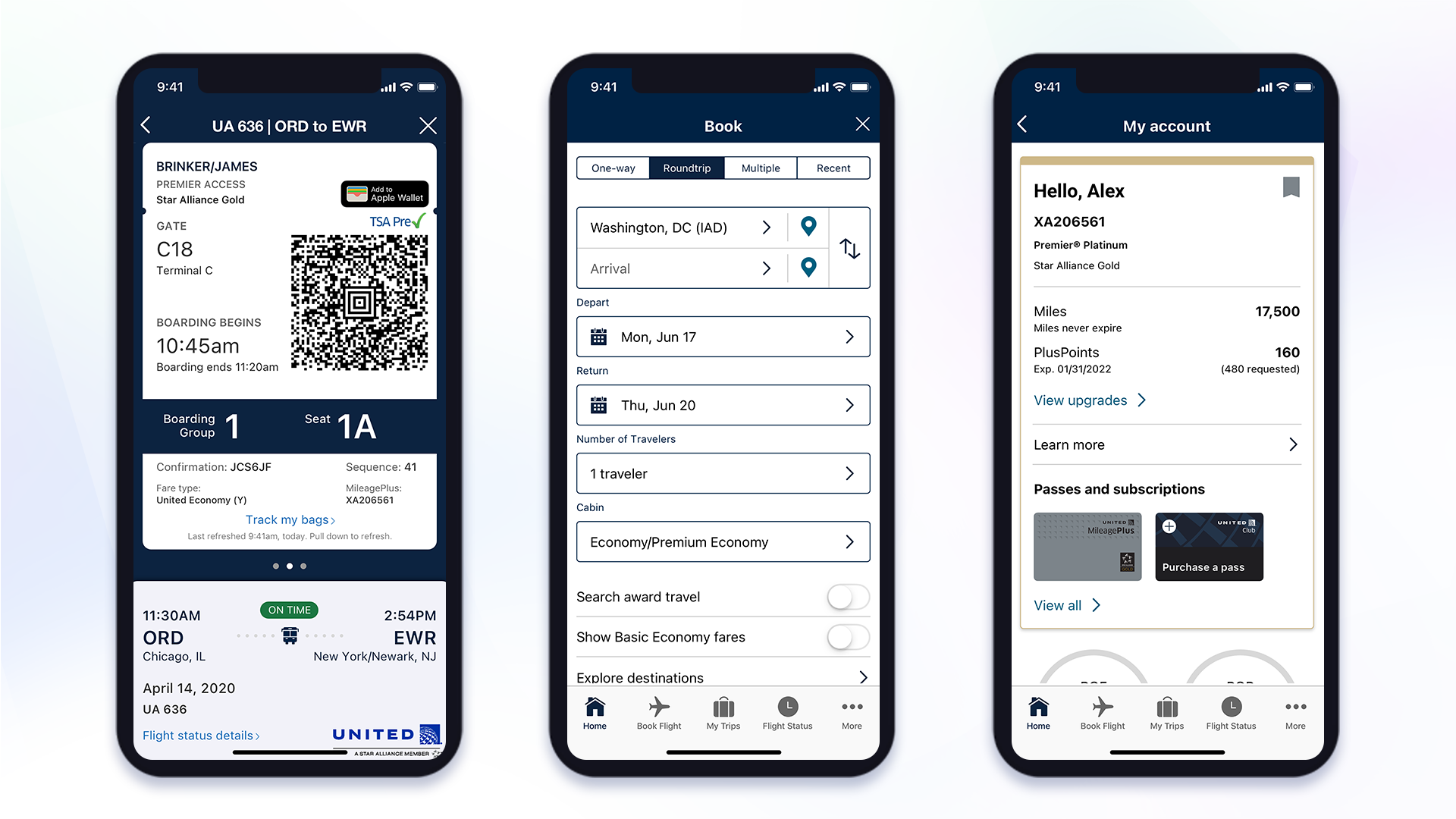
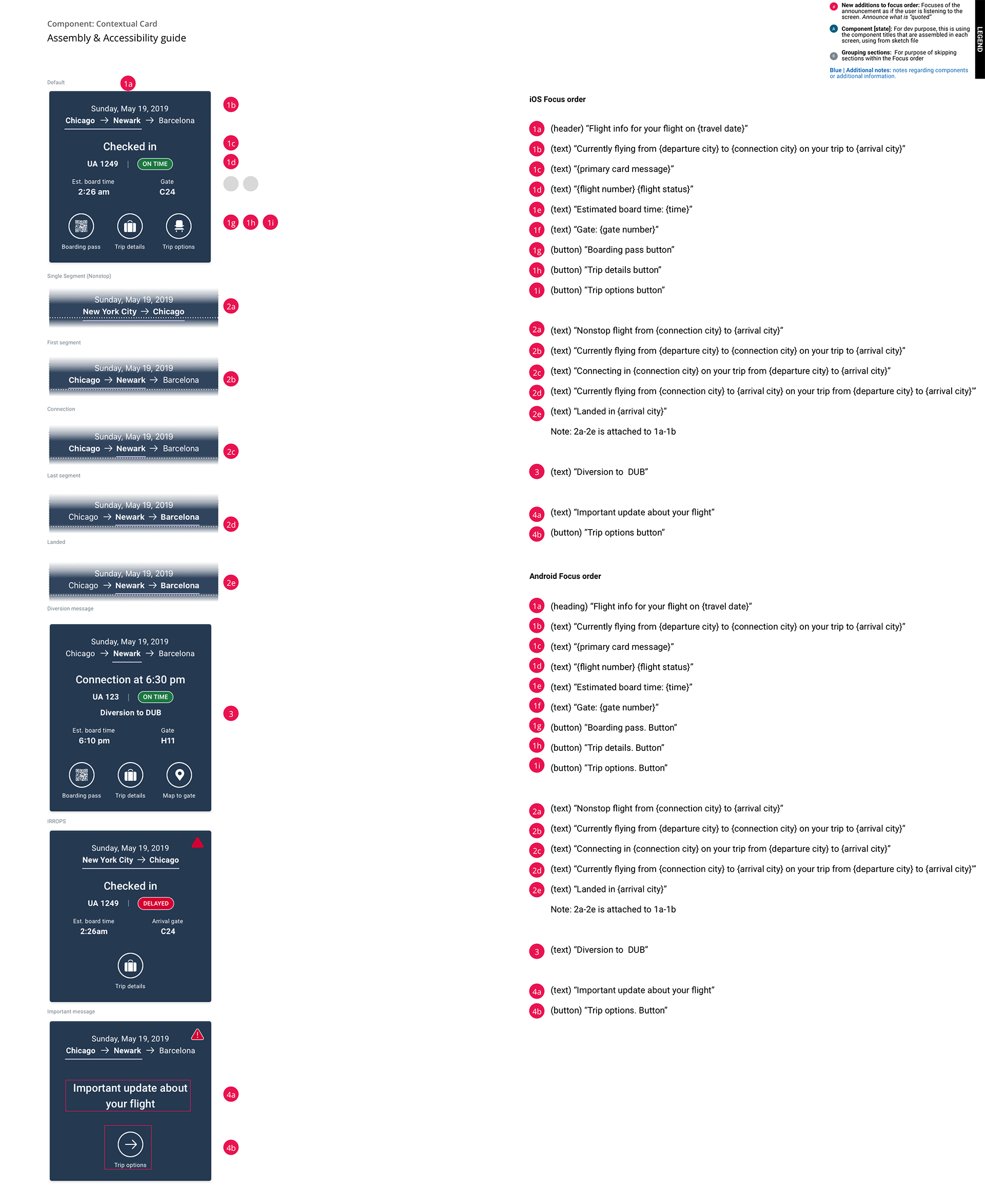
Put the user in control and provide visual and interaction check points. Remove auto advancing screens that occur when the user has filled in a field, and instead let use the user confirm the information. Also provide stronger visual check points as t o where in the process the user it (ex: progress bar, labeled steps).

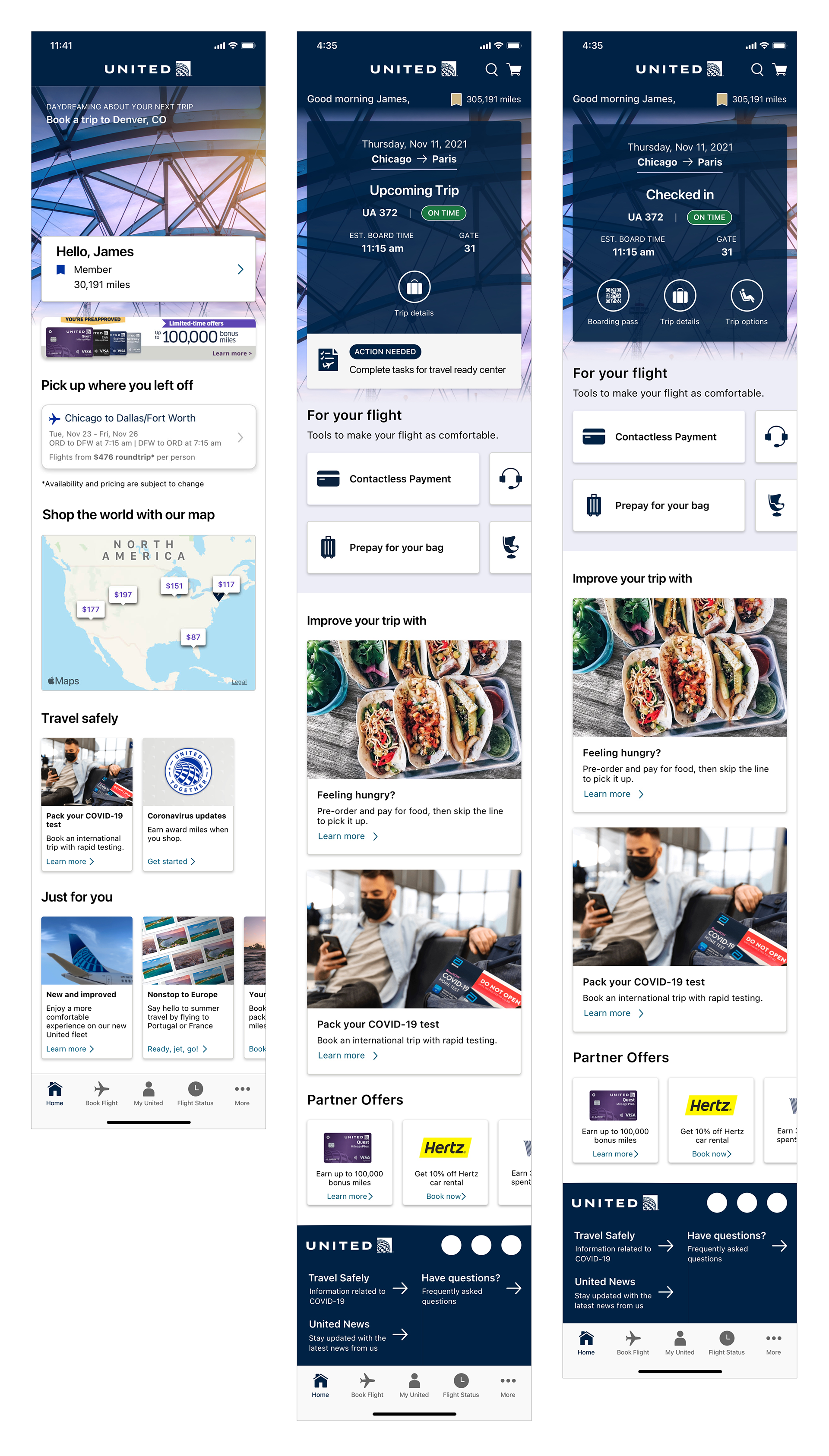
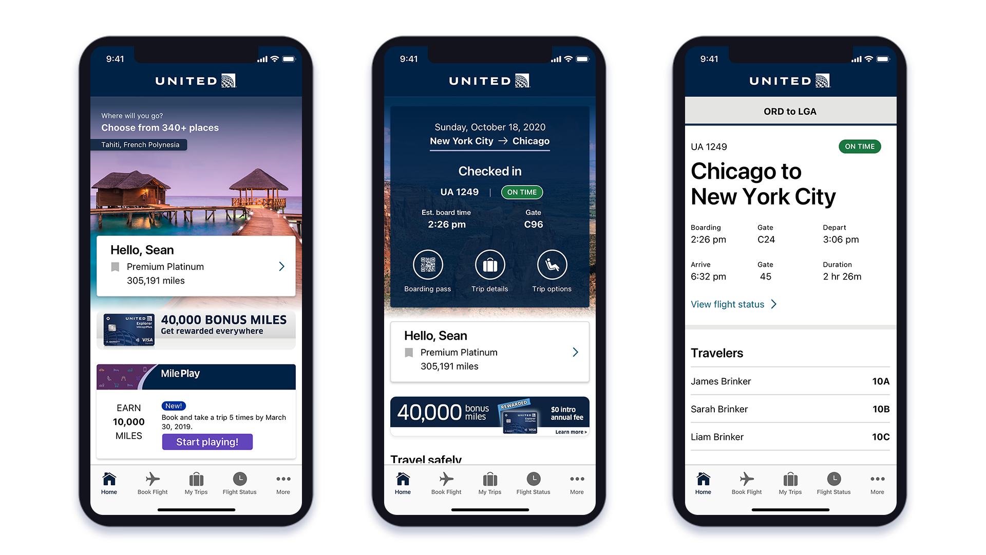
Streamline navigation. Reduce the number of navigation structures on the home screen. Consider adding navigation as a consistent element to the bottom of all screens or as a label on the “back” button.

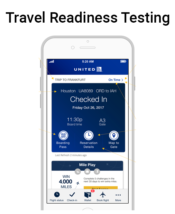
Increase font size, color legibility, and spacing across the board. Increase size to 16 point and make all important text darker than light gray. Do not use light gray for active content, and remove legal where possible to reduce clutter.

Revamp the booking process to aid the mobile user. Create a clear workflow of tasks with modified interaction cues (ex: colors, selection).

05Ideations & Solutions

To fix the known mobile app design challenges, we recommend creating a pattern library that leverages accessibility, best practices, usability testing findings and SME knowledge.

06Prototypes & Usability Testing

As part of the App redesign research effort, we conducted external testing to gather feedback on a contextual redesign of the app. One version of the home page was tested and two versions of flight status screens were compared.

07Evolution

Countless rounds of prototypes, user testing, and tech exploration helped to refine the finalised interface and product.

06Results

UX best practice colour contrast throughout the app added more space between graphics and reordered how information is displayed.

The redesign comes with several new features, including a contextualized home screen that begins displaying 48 hours before a flight and more.

Integrate with the screen reader technologies like VoiceOver and TalkBack built into most handheld devices and read-aloud on-screen messages and notifications for disabled travellers.

next project

Huawei Hybrid Video Solution